This week we have been busy in getting the tiles ready for WisCon 2016 were we are going to exhibit Landlord's Quest for board game enthusiasts. There are four different types of world tiles and today we are going to tell you about the mountain tile.
| Blue ink concepts. 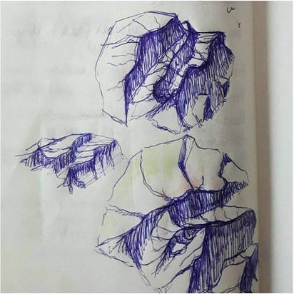 | The mountain tile has been the world tile our play testers have had the most difficult time to interpret. Due to the very dark print some say the old iteration looks like thunder and lightning, a patronus from Harry Potter or even like waves and foam in a stormy ocean. Our artist decided to make a change to this tile. Some concepts in blue ink were made and the final digital result follows below. |
Old compared to the new mountain.
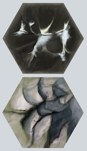 | The old version of the mountain tile had a way too big contrast for the printing machine to be able to handle and that was why changes to the colour palette had to be done. Even though the digital version does have different grey tones (but not enough differences in value tbh), the printing result for the old world tile was almost black and white and confused the play testers. Green and blue shades and highlights were added to the new mountain and here is the final result for the "test print out and play version". The mountain tile is far from ready but this is what it has to look like right now since we have to have a finished test version for you to download before the weekend. |
That will be all about the mountain tile. Thank you for reading and stay tuned for more updates next week! :)
